Bootstrap
As mentioned on the previous page, the Bootstrap framework is included on every Self Service page. Bootstrap is a CSS framework that makes it easy to quickly build designs that look good on all devices (mobile and desktop). See here for some examples and screenshots.
Xurrent Self Service Design does not support custom JavaScript. This means that you cannot use all Bootstrap components or utilities. For example the Bootstrap utility Carousel is not supported because it requires JavaScipt.
The Bootstrap framework provides out of the box styling tied to HTML classes. Take for example the HTML below:
<div class="card">
  <div class="card-header">
    Featured
  </div>
  <div class="card-body">
    <h5 class="card-title">Special title treatment</h5>
    <p class="card-text">With supporting text below as a natural lead-in to additional content.</p>
    <a href="#" class="btn btn-primary">Go somewhere</a>
  </div>
</div>
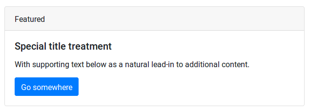
Without any additional CSS styling, this HTML will be displayed as follows:

Grid Layout
The most powerful feature offered by Bootstrap is its “responsive grid system”. We will see this in action later, but as a quick example, consider the HTML below:
<div class="container">
  <div class="row">
    <div class="col-sm">
      One of three columns
    </div>
    <div class="col-sm">
      One of three columns
    </div>
    <div class="col-sm">
      One of three columns
    </div>
  </div>
</div>
On a desktop, this will show up as a single row with three columns next to each other:

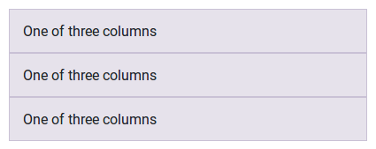
The col-sm class signifies that the columns should only be displayed next to each other on devices that are ‘small’ (meaning 576px wide) or larger. On a ‘very small’ (i.e., mobile) device, the columns are stacked on top of each other:

As you can see on the Bootstrap Grid System, the grid system offers a lot of possibilities. We will make use of some of this in our design.
